We’re pleased to announce the release of our new and improved Netlify docs!
This represents a huge team effort that took place over the course of a year, moving all of our docs content from a subdirectory in our main site at www.netlify.com to a brand new, separate site at docs.netlify.com. In the process, we completely re-organized the information architecture, and added other improvements.
Deeper information architecture
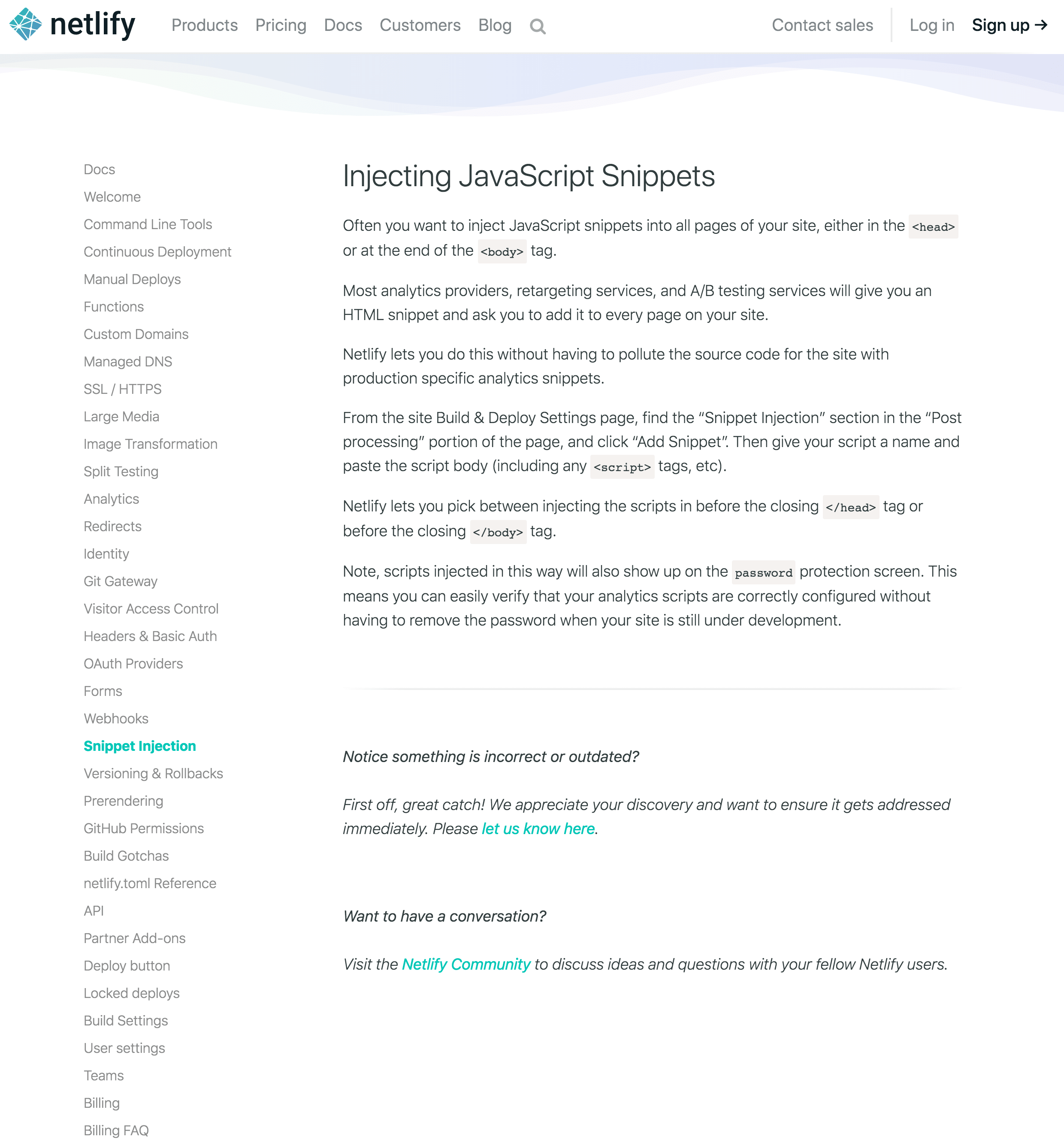
Our previous docs hierarchy was flat, with all docs pages presented in a single navigation list. This worked when our product feature set was fairly small and we didn’t need that many pages, but as we grew over the years, that navigation grew to 35 pages, with more than 10 headings per page on average!

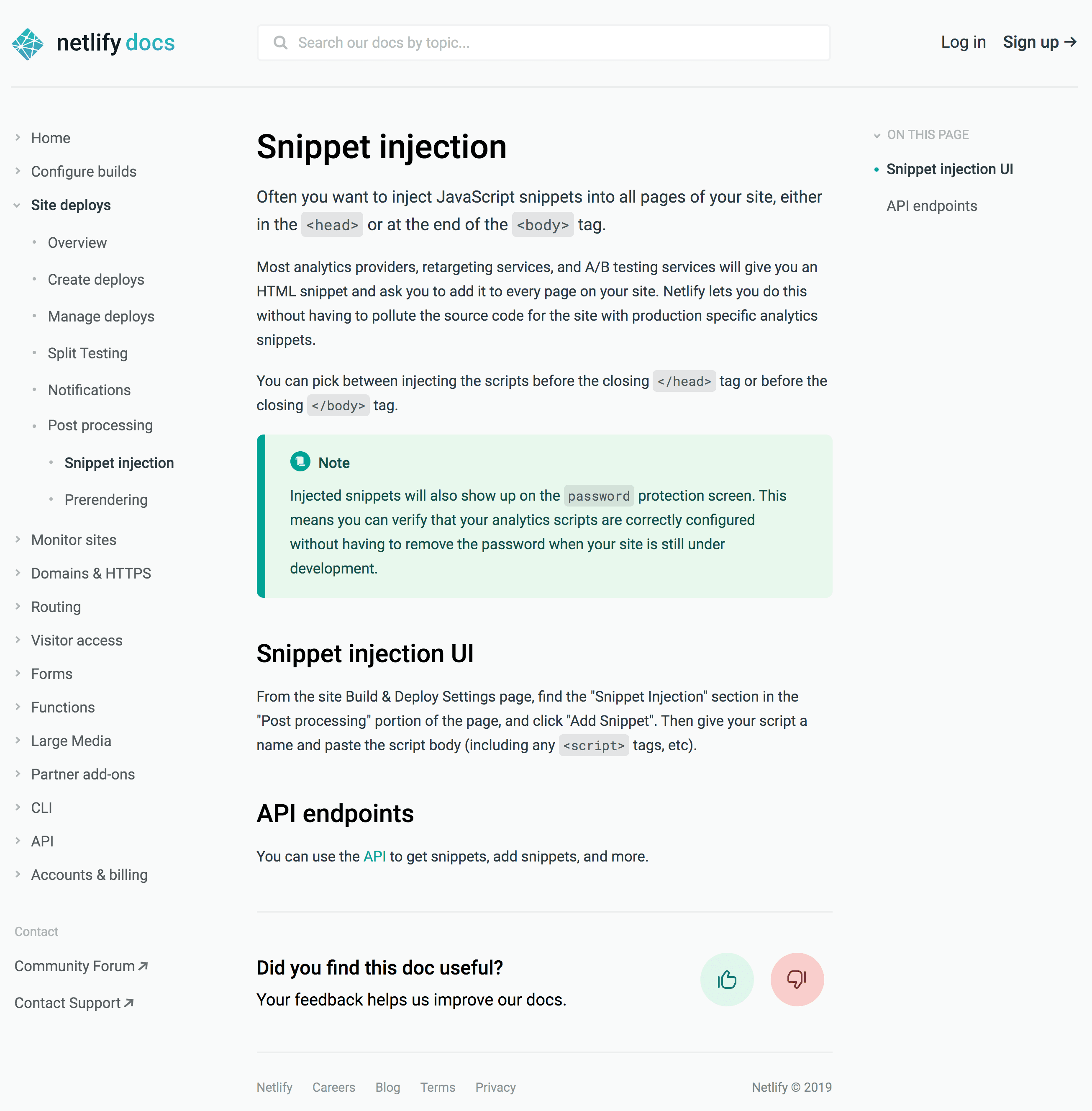
With the new site’s nested navigation menu, we can give content more structure and simultaneously focus the scope of any given view. We’ve reduced the number of top-level navigation items significantly to only 14, while more than doubling the total number of pages to 79, with a new average of just over 5 headings per page.

We’re hoping these changes make it easier for you to browse for the topics you need, and find related information quickly.
More detailed search results
When browsing isn’t enough, or you know exactly what you’re looking for, you need to be able to search the docs.
The previous docs search was fast and effective, but the results showed page titles only. This sometimes made it hard to know which page had the information you needed — especially with an average of 10 headings per page! The new search results include the relevant headings so you get a better idea of what you’ll find.
Consolidated build and deploy docs
Builds and deploys have been a part of Netlify’s core functionality, and thus the docs, from day one. As we’ve added features, or found new use cases to document, our build and deploy content ended up finding homes in all sorts of places in the docs. For example, if you needed information about managing Ruby and Ruby dependencies, you would find it spread across four different pages!
The new information architecture brings fresh order to these important docs, consolidating related information into single topics. That Ruby dependency information? You’ll now find all you need in the Ruby section of the page at Configure builds > Manage dependencies.
Feedback form
Getting feedback is essential to making our docs meet our customers’ needs. During the docs site planning and development, we sought this feedback through user interviews and online user testing tools.
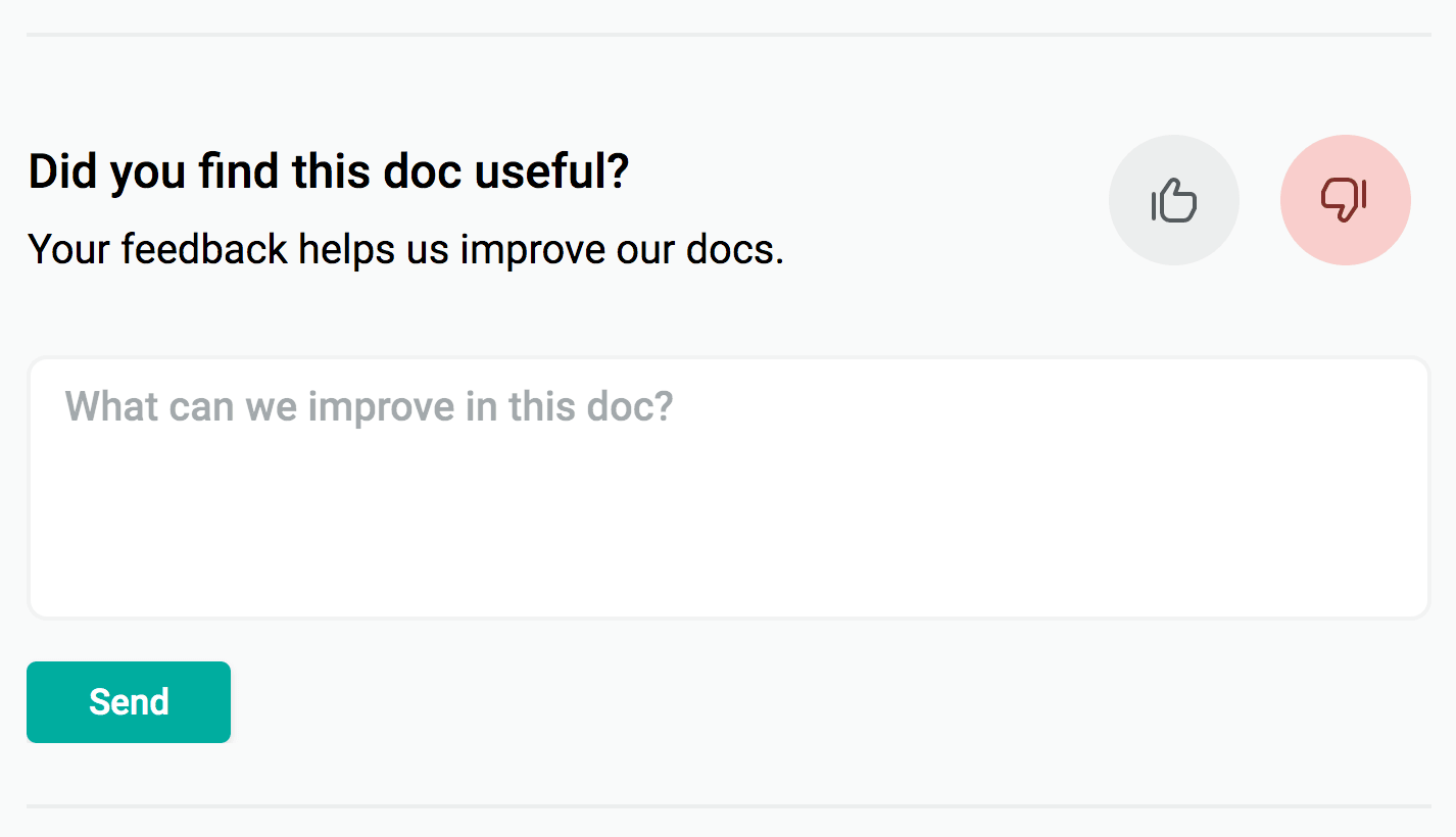
Now that the site is live, we’re hoping to keep that feedback loop going by including a feedback form at the bottom of every page. When you click the 👍 or 👎 icon and/or add an optional comment, it triggers a Netlify serverless function to add the feedback to a shared spreadsheet as well as send us the message in Slack.

What’s next
Because migrating and reorganizing content is a large task on its own, we restrained ourselves from making very many changes to the content itself. However, the work helped us identify areas that can benefit most from improvements, and the new organization provides a clearer foundation on which to build these improvements.
Some updates will involve improving explanations or adding missing content. Others involve integrating other content sources into the main docs, including Open API spec docs and CLI in-line help topics.
Plus, I’m looking forward to writing more blog posts describing parts of our process, including user research, choosing a site generator, and figuring out how to redirect over 400 existing in-page heading links to totally different locations in the new site.
In the meantime, I’m just really excited to finally have the new site out for all of you to use. Go take a gander at it, and see if you learn something you didn’t know before about Netlify! While you’re there, don’t forget to drop us a line using one of our fancy new feedback forms to let us know what you think!
This post has been featured on Netlify Milestones on the road to 1 Million Devs:


