If you’ve ever found yourself wondering “where did that menu option go?” while switching between team and site views in Netlify, you’re not alone.
We heard from many of you that navigating between team-level and site-level functionality wasn’t always intuitive. Today, we’re introducing navigation improvements that make it crystal clear where you are and what you can access.
What’s changed?
Before today’s update, navigating between team and sites looked nearly identical, which made it easy to lose context.
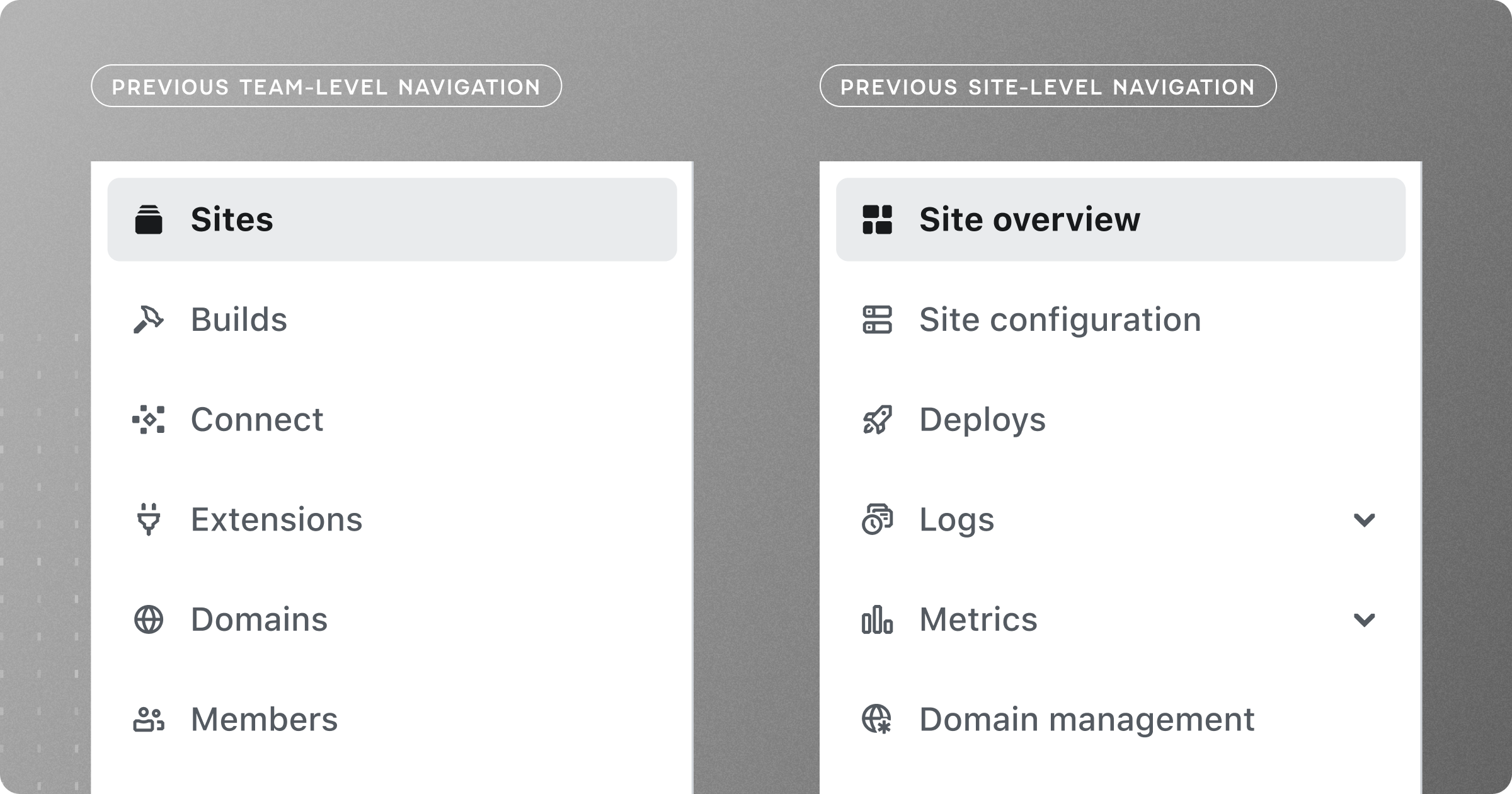
After hearing your feedback about maintaining clarity while moving between different areas of Netlify, we’ve created clear visual distinction between these two crucial contexts of your work.
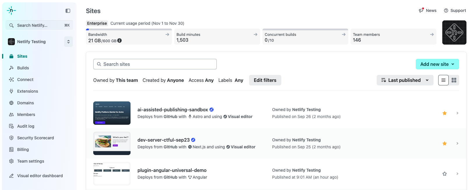
The biggest improvement is that you can now see both team and site navigations simultaneously. When you’re working at the site level, the team navigation collapses to a compact form factor instead of disappearing completely. Need to quickly check your billing status, adjust team settings, or review the audit log? It’s always there, just a click away.
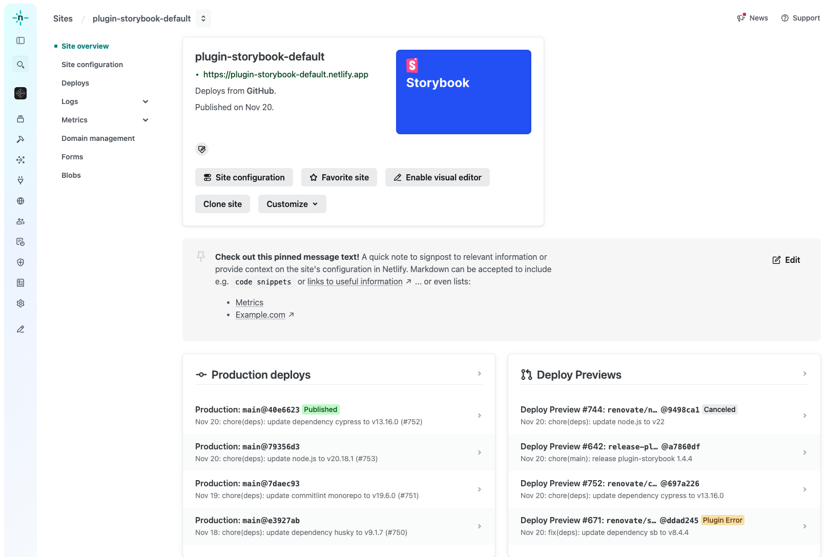
We’ve also evolved the breadcrumb for navigating to a specific site, making it easier for users to move back and forth with confidence.
The page layout has been redesigned to create intuitive zones of focus—navigation and content—while offering flexibility. This adaptability allows users to tailor their experience to their workflow and preferences, such as minimizing the team-level navigation or keeping it open.
The new position of the command palette significantly enhances its discoverability, making it more intuitive and accessible compared to its previous placement.
And last but not least, we’ve updated the mobile design of our app to also reflect context while also making minor layout updates to better utilize space.
We’re just getting started
These navigation improvements are part of our ongoing work to make Netlify more intuitive and efficient for your daily workflows. We’re actively working on additional improvements to make the experience even better, with a focus on accessibility, clarity, and helping you move seamlessly between different parts of your projects.
Tell us what you think
Your feedback shaped these improvements, and we want to hear from you about what’s working and what could be better. Try out the new navigation and let us know what you think.

