After 8 years with our signature teal gem, Netlify is launching a new logo in an exciting first step toward a whole new visual identity.
We’re pleased to introduce: The Netlify Spark

The time is now
While the design of netlify.com has taken on many forms over the years, the brand has maintained use of our signature teal gem logo since its creation very early on in the company’s history.
Netlify has seen exceptional growth, and with the recent acquisition of Gatsby, it’s poised to enter an incredibly exciting new era.
Our journey has taken us from a “drag-and-drop to deploy” service getting some attention on Hacker News, to a full development workflow with build automation, serverless runtimes, and a rich enterprise-ready content layer.
We’ve experienced humbling and rewarding moments such as: our first 1 million developers building on the platform (a number which has far more than tripled since then). We’ve been central to huge shifts in web development as even the largest companies began to embrace decoupling and composable architectures. And we’ve seen our team grow from two people in a small office in San Francisco, to a globally-distributed organization, with colleagues all over the world.
All of this under the banner of a logo which has remained largely unchanged since it was contributed by an enthusiastic early Netlify user and community member (Thanks Jeff! Look how far your logo design took us!).
With all of this in motion, and momentum and adoption ever building, it felt like the perfect time to renovate our visual identity from the ground up. It’s no short journey, so we want to share our progress with you as we go.
Building a new brand iteratively
As most are aware, a brand is more than just a logo; a brand is a voice, vision, and ecosystem that permeates everything that a company represents. Crafting a new brand from the ground up is a massive undertaking.
When considering how to approach this huge task, we looked to the very thing we know best: releasing code. We write software iteratively, starting with an MVP and releasing new features as they’re built, testing assumptions, and adding features as we go. Why not approach the brand in the same way? A new logo felt like the perfect MVP, so that’s where we’ve started.
A spark of inspiration
An immense amount of research, thought, and care went into the design process for the new logo. In the end, our new logo was created to tell the story of Netlify.
Throughout the entire process, there was a visual that we kept coming back to.
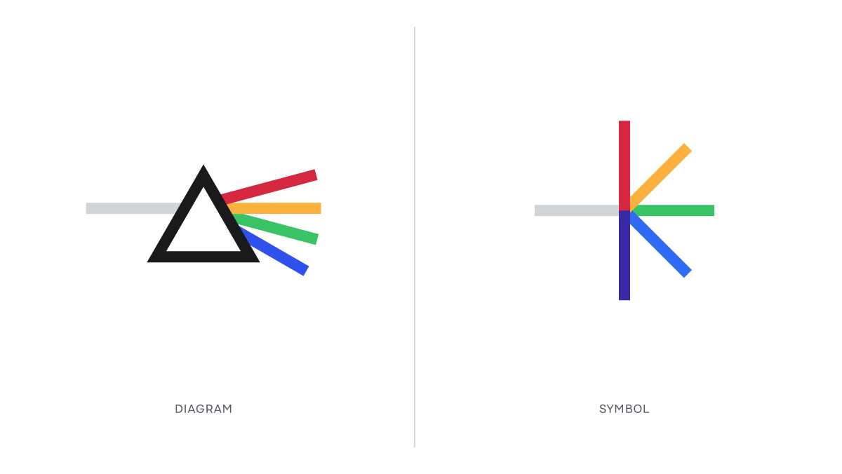
It drew inspiration from optical dispersion: the phenomenon by which light separates into individual colors as it passes through an object: One input → numerous outputs. If we’re being metaphorical, this sketch could represent every single task a developer has to deal with, and how it can be executed many different ways.
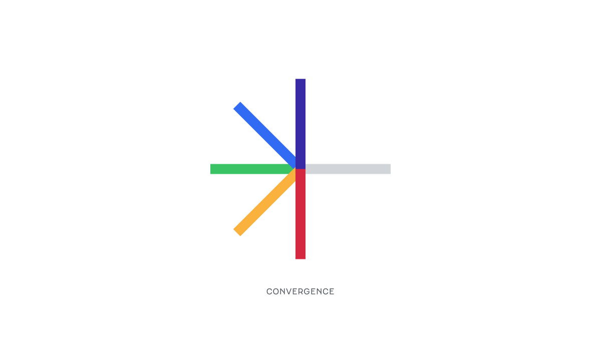
But we discovered that if you reorient it, you could tell another story. This angle exemplifies convergence — much like the convergence of thought, perspectives, and expertise in the very community-based act of building the modern web.
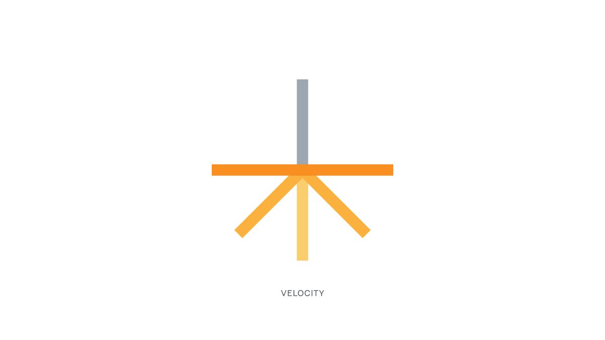
Once again reoriented, it felt reminiscent of a launching rocket — of the immense velocity and exhilaration of launching something new into the world. Is this feeling not the biggest reason why many of us build software?
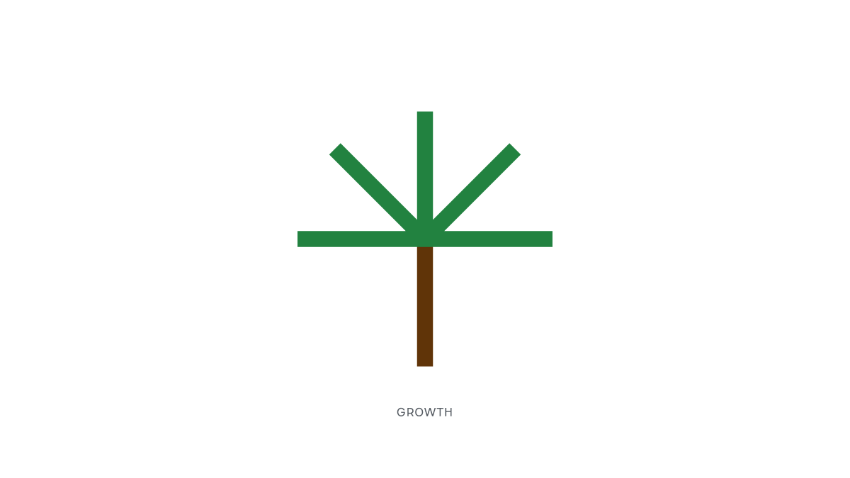
Finally, this final angle represents the steadfastness, dependability, and stability of an established tree. These qualities represent the work we do between the excitement of launches, and underpin the success of what we build.
After hundreds of logo iterations, and combining typefaces, symbols, lockups, and colors, we landed on this: The Netlify Spark.

If you zoom into the edges of the letter forms and the lines, you can get a sense of strength and durability. If you zoom out, there’s a rounding effect that indicates approachability. The lines conform to the shape of the ‘N’, and all the lines then converge into a singular output, using Netlify as the conduit.
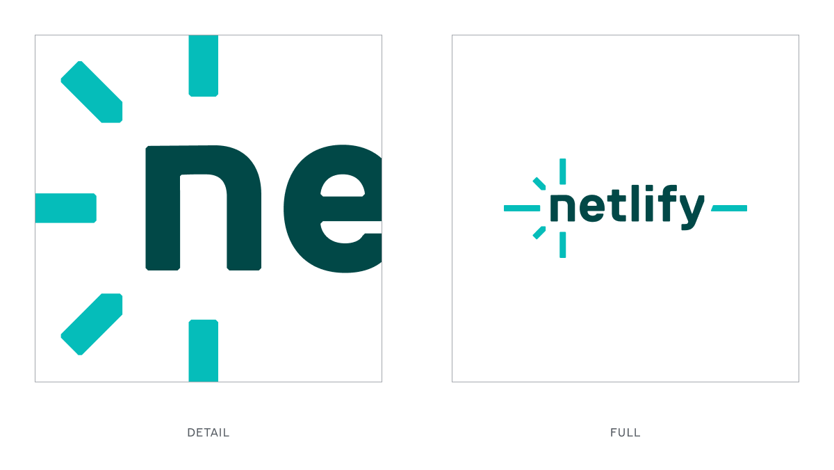
The Netlify Spark is more than a new logo: it’s the next iteration of Netlify’s story, your story, and the story of everyone building for the web.
This is just the beginning.
We’re excited to take you along as we continue to iterate on our brand and further align our visual identity with the story of building for the modern web. Thank you all for being part of our story!


